- INTRODUCTION
- LECTURES
- Critical practices in the Architecture of the Baltic Region / An Introduction by Lolita Jablonskienė
- Ieva Zībārte / Uncensored Admiration. 10 Quiet Forms of Dissidence in the Life and Work of the Architect Marta Staņa
- Ingrid Ruudi / Critical Architecture between Prestroika and Independence? GROUP T Architects in Tallinn
- Marija Drėmaitė / Critical Practices in Lithuanian Architecture of the Soviet Period
- Andres Kurg / The Papers, Exhibitions and Buildings of the Tallinn School in Estonia
- Ivan Ristić / Bogdan Bogdanović – the Practice of Architecture under Changing Political Regimes in Yugoslavia
- INTERVIEWS
- ESSAYS
- Tor Lindstrand, Håkan Nilsson / Staging Subversive Opportunism in the Age of Feedback Loop
- Manuel Bürger / Slipping Through Templates. Limitation as a Tool of Control - A Design Observation
- Ethel Baraona Pohl / Emancipatory Architecture
- Jack Self / The Only Task of Architecture
- Eray Çayli / Turkey’s Construction Boom as Opportunity and Publicness as Medium of Subversion
- ABOUT
ALF 04
MANUEL BÜRGER. SLIPPING THROUGH TEMPLATES. LIMITATION AS A TOOL OF CONTROL - A DESIGN OBSERVATION

Template (Fitness) Tower. Source: Fitnessturm MPS 35 mit 35 Studio-Maschinen by Erfinder1995, Wikimedia
Function over form: the template is a perfect tool to maintain the steady stream of capitalist information culture. By filling in the blanks of a predetermined layout, we are able to design and communicate fast—very fast. But although the template as an input device1 feels quite natural to us, its character is yet to have been truly understood. When communication is restricted by pre-given limitations, is some of its force or substance lost? Is the template a space of values that ensure standards? Are the spheres of common understanding and public discussions quite defined by templates? How are our identities shaped by the templates we create?
This essay is a starting point for exploring the restrictions of contemporary information culture through the use of templates. Of course, it is easy to say that this attempt should also develop strategies of how to overcome instant-design set-ups by affirmative strategies. Is it possible to step over the constraints of our communication culture while speaking the same template-lingo? Or to design content in a manner that is blind and deaf to the limitations?
WORLD OF TEMPLATES
Let us begin this story in the early 90s, the time when Gilles Deleuze wrote “Postscript on the Societies of Control” (May 1990) and Bill Gates was coding Microsoft Office (release: 19.11.1990), which would offer mainstream design features in desktop applications for the first time. In particular, the use of presets (predefined design styles) and templates (predefined page layouts) were becoming available to help users finish an invitation for their birthday party in a minute or design a business report in under an hour. And because Google Image Search was not yet available, the ability to insert Clip Art (image collections, mostly illustrations and artistic style) was also a beloved strategy for ‘pimping’ documents.
Gilles Deleuze addressed the change from disciplinary societies (“spaces of enclosure”) to societies of control, in which the individual "surfs easily between the environments,” for example between work and home. “The disciplinary man was a discontinuous producer of energy, but the man of control is undulatory, in orbit, in a continuous network. Everywhere surfing has already replaced the older sports. [...]”2 Similarly, Microsoft Office's strategy was to guide the individual in every situation, be it work or leisure; the template masters a sporty lifestyle. “Many young people strangely boast of being ‘motivated’; they re-request apprenticeships and permanent training,” Deleuze wrote. Bill Gates’s templates had become an example of how to maintain control by agreeing on restriction and governance from above—ultimately to achieve perfection in and through multitasking, one big goal of a growing networked society.

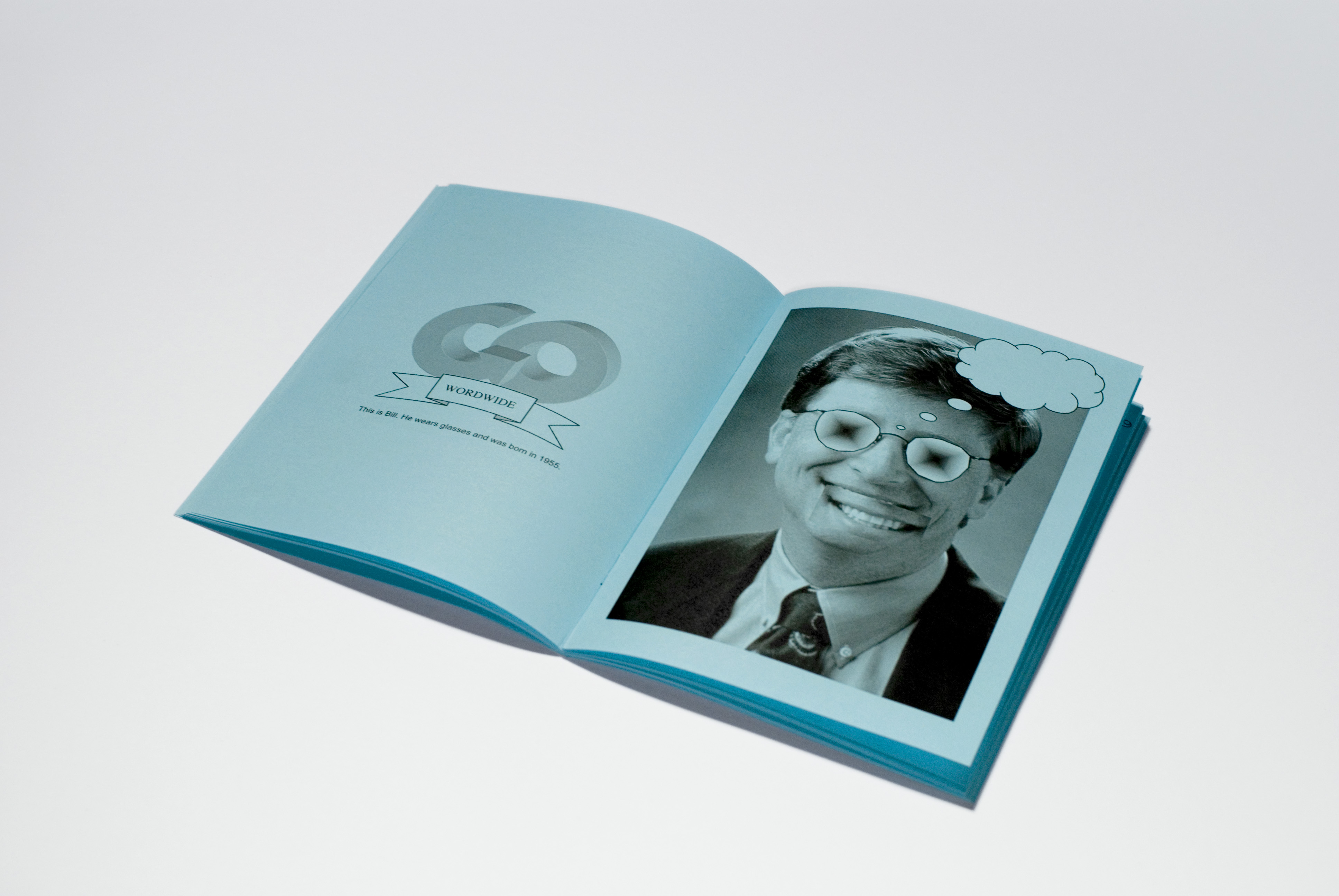
Microsoft Word Zine "I doc. you will" – an example of affirmative design strategy. By Manuel Buerger, 2006
In addition to getting used to the idea of predefined layouts and reconciling creativity and using the design guidelines correctly, something else is demanded of us in times of digital capitalism, which is being an active part of worldwide communication processes—participation as competence! When Michael H. Goldhaber wrote about the Attention Economy in 1997, he recognized the relationship between information and attention. “The real promise of the Web and the net and the like, though also a promise it can never completely fulfill, is to help satisfy the ever more pressing desire for attention. To get attention you must emit what is technically identifiable as information; likewise for information to be of any value, it must receive attention.”3
The template, a winner of the 90s through its quick creation of visual content, now gets its chance on the Web—making participation easily possible. It worked ‒ limitation in cyberspace makes everything there work better and faster too. While Myspace opts for an open design ideology, with hundreds of different profile looks possible, Facebook limits design opportunities dramatically: to the profile and cover photo. Twitter does not even care about aspects of (self)design and makes limitation its central feature: messages and status updates no longer than 140 characters. Today’s commercial understanding of communication is one of “the user can write short statements, or, please, just let him take a picture”.
 User is playing with the interface of instagram. Source: http://mashable.com/2013/07/11/instagram-photo-hack/
The Web certainly is not that conformist yet; you might have thousands of design templates available for your Tumblr blog :D. But in comparison to Web 1.0, where an understanding of what you were doing and designing was required to overcome the restrictions of the html code with your own skills, today’s template culture allows users to remain pretty unaware of technology and leaves you merely scratching the surface of what is possible.
While the template as a predefined design layout still exists, its key feature—limitation—has become the most important part of designing and processing communication today, while the emergence of features like emojis (see the image above) might be a good example of how people try to express themselves within restrictions.
CONTROL & COMMUNICATION
Restrictions keep ideas inside the system—within the thinkable, the compatible of prevailing ideology. Whenever freedom of speech is in danger, we recognize the social-political corset that restrains other ways of thinking. The template might work as a metaphor—or even a blueprint—for social living.
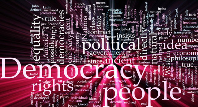
Word cloud concept illustration of democracy political glowing light effect PowerPoint Template. Source: http://www.crystalgraphics.com/
When Henri Lefebvre made his argument about the capitalistic determination of space in the 1970s, he pointed out the broad homogenization of the urban landscape, describing a repressive space that actually erases distinction. Lefebvre explores modes of representation and notes that social space is lived through its associated images and symbols: “(Social) space is a (social) product,"4 based on cultural interaction.
This feedback-loop idea of the social production of space and the vice-versa spatial production of society applies it to the template as well: society produces templates, and templates shape the society that produced them.
Two examples for this bipolar relationship are David Horvitz’s work “Public Access”5 and the Nike ID template policy. David Horvitz traveled down the west coast of California and took pictures of himself standing in Caspar David Friedrich’s famous “Wanderer Above the Sea of Fog” pose at almost every public beach. After taking enough reference pictures, he uploaded them to a Wikipedia article, dedicated to each of the locations.

A view from the Davenport cliffs at sunset. By David Horwitz , "Public Access", 2010
The Wikipedia community appeared to become quite annoyed by the same, lonely man appearing in every photo… After discussing this topic broadly, all Horvitz’s pictures were deleted, retouched, or recropped to put him out of focus. The community’s verdict had been: “Crap photo of dubious sourcing.” While Horvitz plays with the motif of repetition—a known grammar of the template—in his work, the Wikipedia community determines the rules of how to use its templates, setting a policy of the blank page/space. Thus, here is the feedback loop at work ‒ society produces templates, and templates eventually shape society.
Similar thoughts emerge from the Nike-ID6 interface/template. While the company prints an individual code/message/name on the tongue of any Nike-ID shoe, the template refuses to accept such terms as OBAMA, HATE, or ADIDAS (which does not even fly spread over both tongues: "ADI" and "DAS"). It will be a tough job to print officially subversive messages on your Nikes to make a statement using the name of the global player. Would it not be interesting to listen to Nike's creative team setting down the list of forbidden terms7? Again the template feedback loop is present here: stay clean, politically correct, and just…do not even try it.
The template should be thought of as the ugly face (though not literally ugly) of the oppressive structures of the communication culture in the context of advanced capitalism.

Nike ID interface. Source: http:www.nike.com
Too dramatic? Why? When you are striving for profit, you might not be interested in the openness of your communication tool. You are interested in how many millions of people are using it, living with it, and creating a continuous stream. An easy, common understanding of the template is what makes it successful, and surely the ideal iteration does not permit criticism of its own structures, which would render it weak. Templates are top-down. And it is actually hard to imagine a bottom-up template without losing the advantages of the template itself: fast and safe communication.
RESISTANCE
In my essay “Slippery Design”8 the term Fitback describes users’ potential for fast feedback ‒ extremely sensitive to visual codes, connected to technology, digital life, and the Web. The user is able to establish communication over diverse networks, penetrate microcosms and, potentially, reach the masses very quickly. Brad Troemel calls a similarly skilled person an Aesthelete, a visual artist, writer, or musician distinguished primarily by his “rapid production.”9 The goal is to generate the greatest possible amount of attention across online platforms, to achieve constant output on the web and inspire the ongoing rehashing of work, which only become real through that rehashing.

Parker Ito's anti-masterpiece of rapid production via Brad Troemel. Source: Brad Troemel, "Athletic Aesthetics, 2013
A popular format for rapid production is the meme, a term that was introduced a good 40 years ago by Richard Dawkins in his book “The Selfish Gene,” though it did not immediately assert itself in the cultural sciences until much later. With the growth of social networks and the hunger for information, the idea of the meme has returned to the spotlight. Defined as a “unit carrying cultural ideas” that evolves through “natural selection, variation, mutation”, the meme is in constant struggle for survival. It strives for attention. It is just as dependent on connecting communications as it is changed by them.

The "Impact" typeface (black outline) is significant for most of the memes. Source: The Web
The meme has become one of the most successful formats for criticizing social and political issues in digital capitalism. Successful because it appropriates the concepts of the template: the use of the same font style over and over makes it easy to recognize and easy to create.
“Memes are not phenomena of language, they are phenomena with language” says Metahaven. At the same time, they offer a dense amount of information thanks to the meme’s crafted combination of text and image. The meme seeks to capitalize on the communicative advantage of its multilayered referential possibilities in order to induce the recipient to connecting communication and dissemination. The tone of the meme, and its sense for contemporary news, slogans, and promises, is another important aspect, and it’s primarily driven by humor. Constantly on trial, the meme is supposed to lack depth and live on populism and sexism, but obviously its political potential cannot be denied—and that’s precisely because of the jokes:
“Why jokes? And why now? Here’s why. Jokes are low budget. [...] Governments the world over are fortifying themselves against their own citizens, and most of all against their jokes. But jokes easily pass through the walls of the fortresses. The Joke is an open-source weapon of the public”.10
Nobody wants to end up in a society of sarcasm and irony, but for subversive opportunism it might be the best option. Humor has encouraged humanity to become aware of problems for hundreds of years; the word humor actually derives from the Greek humours—body fluids that control health and emotions. If an opportunist has to use the tools of the system (which is the premise of this topic, right?), he is good at learning how to make people excited and smile through—or despite—contradictions of the ruling norm.

Obama memes are quite popular. Critical context also possible. Source: The Web
In “Cute Cat Theory of Digital Activism,” Ethan Zuckerman explains how social platforms like Facebook and Twitter are perfect for political activists, as they become immune to government reprisal. Shutting down a large public platform would provoke a large outcry, so subversive content cannot be easily isolated. “Blocking banal content on the Internet is a self-defeating proposition. It teaches people how to become dissidents—they learn to find and use anonymous proxies, which happens to be a key first step in learning how to blog anonymously. Every time you force a government to block a web 2.0 site— cutting off people’s access to cute cats—you spend political capital. Our job as online advocates is to raise that cost of censorship as high as possible.”11
The meme, like the political poster of yesteryear, has a wide reach. Its use for oppositional purposes is frequently discussed as it does stimulate political discourse. The notion of the “Temporary Autonomous Zone”12 by Hakim Bey could be employed to describe the meme: a short-lived utopian place that evades the traditional dynamics of law and hierarchy.
Again, the meme and its self-referential power—“I know you know that I know”—can evolve our “tactical knowledge”13 and ideas of resistance—at the same time that the authorities are helpless. Being aware of templates, and knowing how they regulate discourse, can make you quickly very powerful. Talking with Marc Schwegler about a conscious “pornoboycott,” “radical democracy,” and the comeback of the “body” (all topics that could be deconstructed into modes of function, behaviors, and templates) in a late-night kitchen session, he points out that the meme is the noise of the information canal that is set up by templates in their own right. The noise is crucial: it is not a vocabulary of slick templates, though the tinnitus that it evokes shows likely alternative ways of living.
To make a long story short, the template today finds itself confronted with constant top-down censorship processes. An increasing monitoring of the form (skin filters etc.) combines with the control of content (forbidden or flagged word lists on Facebook, Google, etc.). Users need the awareness that they can move and act within these circumstances. Olia Lialina introduced the concept of General Purpose Users, who “can write an article in their e-mail client, layout their business card in Excel and shave in front of a web cam.”14 These users must deal with the suppression to know how to get everything out of the template—from affirmative overuse to misuse.

Russian travel blogger Sergey Dolya knows how to shave without mirror. Photo by Mik Sazonov, from the essay "General Purpose Users" by Olia Lialina, 2012
HUMAN TEMPLATES
“To add a ‘human factor’, enter the desired degree of ‘human-ness’. 0% is exact; 100% is quite out-of-beat.” So says the interface of the “Humanize” function in Easy Beat, a midi composing software. The issue that has to be clarified is ‒ What is the human quality of the human? When compared to the digital, it is probably the irregular, supposedly imperfect. The “Humanize” effect moves notes off the grid; in other words, a higher level of “human-ness” put the notes “off beat,” which makes the composition sounds more real.

The "Human Factor" function in Easy Beat. Source: Easy Beat 2.2
To be “off beat” is apparently THE post-digital desire. When you feel your heartbeat unsteady—enjoy this moment! Unpredictability is what you're looking for. AirBnB. Tinder. Excitement. Who knows what could happen. Fiverr.com is a platform that helps people find help from other people—to design a logo, write ready-to-use copy (or your PhD dissertation), anything—for not-so-much money. You never really know what to expect; you might think you’ll get a better result than you would if you had done a task by yourself, but the “human factor”—the unknown, the uncertain—is (in addition to the cost) a big part of the fun.
xtremeridewish15 wrote me a little explanation of templates for $5. Does her writing offer us any additional insight now? Can we reflect already better on the topic?
“Templates make people’s work easier. They are a way to simplify repeatable messages and entries without having to re-create the whole thing from scratch. Templates are available for Microsoft Word applications, Macs and more. When a person knows the entry blocks will be consistent, they can use a template. If someone needs a preset document template that doesn't already exist, they can make it. Templates cut down on time by minimizing keystrokes. [...] Certain parameters that will not change are already filled out on templates. For example, a resume template has a pre-filled space for the name, address, experience, accomplishments and skills.”
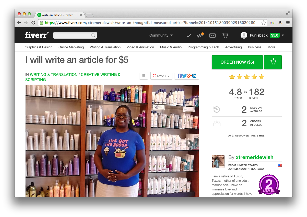
I will write an article for $5. Source: xtremridewish, www.fiverr.com
How chaotic would the world be if we could customize it all? Will templates ever become redundant because the user—or someone like xtremridewish—is empowered to design them quickly? History shows though that the most successful mechanism for leading masses is establishing conformity. The template implies conformity, and the demand for them to make our lives carefree means the corset will be fashionable as long as there is no other concept for reaching and impressing the masses with something besides uniformity. Wanna read the footnote?16
Instagram’s square photos are definitely not what make the app popular. Rather, it is the effortless appropriation of common habits into a group mentality: Instagram gives you the opportunity to become a member of a community by sharing a picture of your meal.
The template has proven a winning concept, but we must learn about its different justifications, its different modes of making information accessible and controlling the thinkable. Criticism is thereby only fruitful if it can reflect the set-up, the actual design and creation of the template. The template’s visual outcome—how it looks—is not that important. What is way more interesting is how the template was designed, why it looks the way it does, and what ideas it represents. If affirmative opportunism can construct an understanding of this, it might frighten the power, juxtaposed against the structure’s shoddy foundation as it locates the tiny holes in its slick exterior.
Slippery Design Extended! Your decision is all too often an unwitting acceptance of template culture, even your nihilistic lifestyle is an aesthetic gesture of total affirmation.17 Though by recognizing your Fitback ability the door to resistance stays open, the deconstruction of the default remains the highest goal. Slippery Design Extended is in search for multiplication of communication formats by recognizing the restrictions and imbalance of communication culture.
Please take this last note with you: You might enjoy further exploration of social interaction through the lens of templates. Examine fashion, politics, regulations, anything. Power structures show themselves. But this essay has come to an end now—3,000 words.
1. It is important to take the template as an abstract concept for shaping data into consideration—to make it accessible for receivers by formatting content in a design/communication style/concept. Therefore, design templates are not the only form that should be discussed here; the Google input field could also be seen as a template, as could Facebook’s “What's on your mind?” input field, which puts information on a user’s wall. The template is merely a concept of restricted data input.
2. Deleuze, Gilles, “Postscript on the Societies of Control”, in: Post L'autre journal, Nr. I. 1990. See also: https://files.nyu.edu/dnm232/public/deleuze_postcript.pdf
3. Goldhaber, Michael, “The Attention Economy and the Net”, in: Telepolis, 1997, http://www.heise.de/tp/artikel/6/6097/1.html
4. Lefebvre, Henri, The Production of Space, Blackwell Publishing, 1991, p. 26.
5. http://rhizome.org/editorial/2011/feb/18/something-fishy-pelican-state-b...
7. Facebook: http://ramseymohsen.com/2011/02/458-bad-words-blacklist-for-facebook-pages/ or Google: http://fffff.at/googles-official-list-of-bad-words/
8. Buerger, Manuel, “Slippery Design”, 2013, in: http://www.manuelbuerger.com/slipperydesign-en
9. Troemel, Brad, “Athletic Aesthetics”, 2013, in: http://thenewinquiry.com/essays/athletic-aesthetics/
10. Metahaven, Can Jokes Bring Down Governments? Memes, Design and Politics, Strelka Press, e-book, 2013.
11. Zuckerman, Ethan, “Cute Cat Theory of Digital Activism”, 2008, in: http://www.ethanzuckerman.com/blog/2008/03/08/the-cute-cat-theory-talk-a...
12. Bey, Hakim, “T.A.Z.: The Temporary Autonomous Zone”, in: Autonomedia, 1991. See also http://hermetic.com/bey/taz_cont.html
13. Metahaven, Can Jokes Bring Down Governments? Memes, Design and Politics, Strelka Press, e-book, 2013.
14. Lialina, Olia, “Turing Complete User”, 2012, in: http://contemporary-home-computing.org/turing-complete-user/
15. “I am a native of Austin, Texas; mother of one adult, married son. I have an immense love and appreciation for words. I have never tired of writing. I have a keen eye for typos, grammatical errors, and style problems, etc. My ability to write, proofread & edit are all totally God-given”, fFrom the profile of xtremridewish, fiverr.com.
16. What if someone offers to design your Facebook profile in a way you feel would best represent you, with different colors and fonts—special design features. Would you let him do it? Would you be afraid that Facebook would block your profile, your connection to life? Or would your interest in looking different override that fear? Staying “normcore” is not an answer to a problem.
17. Inspired by Rossiter, Ned. Black Box Politics: Data Centres and the Design of Infrastructural Counter-Imaginaries Datafied Research. Talk at the City University of Hong Kong, 2014


