- INTRODUCTION
- LECTURES
- A_Mart Kalm / Modernism In Estonia: From Industrialist’s Villa To Kolkhoz Centre
- B_David Crowley / The Fate of the Last Generation of Ultra-Modernist Buildings in Eastern Europe Under Communist Rule
- C_ Claes Caldenby / Urban Modernity. Nordic-Baltic Experiences
- D_Marija Drėmaitė And Vaidas Petrulis / Modernism In Soviet Lithuania: The Rise And Fall Of Utopia
- E_Anna Bronovitskaya / Glimpses Of Today In Visions Of Russian Avant-Garde Architects
- ESSAYS
- Ernestas Parulskis / Commemorative Plaques In Lazdynai
- Indrė Ruseckaitė and Lada Markejevaitė / Elena Nijolė Bučiūtė’s Personal Modernism
- Maija Rudovska / In The Shadows Of Nostalgia. Marta Staņa’s Legacy In Latvia
- Liina Jänes / Position Of The “Other”: The Architecture Of Valve Pormeister
- Julija Reklaitė / Amber Inclusions. What Modernist Memorabilia Can Tell Us
- INTERVIEWS
- Talking About the Richer Picture. An Interview with David Crowley by Aistė Galaunytė
- An Active Archive For A Public Discussion. An Interview with Hartmut Frank by Eglė Juocevičiūtė
- Cheating The Space Or Cheating The Time. An Interview with Frédéric Chaubin by Eglė Juocevičiūtė
- More Freedom, More Privacy. An Interview with Anna Bronovitskaya by Eglė Juocevičiūtė
- Sinchronicity of Ideas. An Interview with Andres Kurg by Eglė Juocevičiūtė
- Recycling Socialism. An Interview with Aet Ader by Viktorija Šiaulytė
- ABOUT
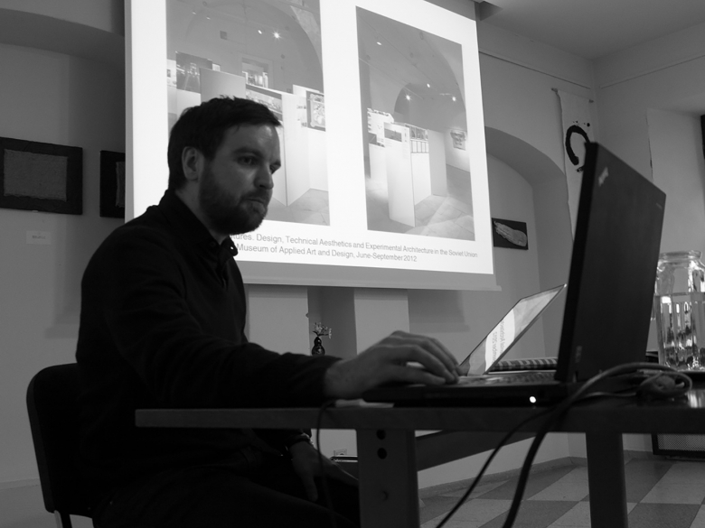
Andres Kurg during the seminar in Vilnius, October 25th, 2013. Photo: Ieva Marija Malinauskaitė
Andres Kurg is an architectural historian and researcher at the Institute of Art History of Estonian Academy of Arts in Tallinn. His research looks at architecture and design in the Soviet Union in the late 1960s and 1970s in relation to the technological transformations and changes in everyday life, as well as in its intersections with alternative art practices. He has co-edited and authored “Environment, Projects, Concepts. Architects of the Tallinn School 1972-1985” (Estonian Museum of Architecture, 2008) and curated “Our Metamorphic Futures. Design, Technical Aesthetics and Experimental Architecture in the Soviet Union 1960-1980” in Vilnius National Gallery (2011-2012). After participating in a two-day seminar “Showcasing modernisms: between nostalgia and criticism (contemporary visualisation and storytelling)”, which took place in Vilnius in October 2013, Andres gave an interview about his experience in researching, showcasing and feeling nostalgic to Estonian modernism.
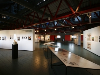
During the discussion I was trying to remember and somehow separate the different approaches towards showcasing ideas on modern heritages, and I remembered this very strange combination of two modern architecture shows that we had here in Vilnius in the Contemporary Art Centre (CAC), one curated by Harmut Frank and Simone Hain called “Two German Architectures: 1949-1989”, which was very historical, showing models and blueprints that had been hidden in drawers and another curated by Audrius Novickas, called “Possible modernism”, which used artistic strategies and was more of an installation. The other thing I thought about was how Ole Bouman reorganized the NAi archive, organizing it according to kind of abstract notions – the six traits of Dutchness: experimentalism, curiosity, collaboration (with nature), accessibility, austerity and makeability. Working with Estonian modernism, you are lucky enough to be able to work with the well- articulated critical ideas of architects, not only with the built or designed objects. After making the “Tallinn School” and “Our Metamorphic Futures” exhibitions, what is your experience in displaying ideas? Was there an essential difference between these two exhibitions in the sense of showcasing?
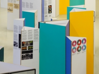
With Our Metamorphic Futures we wanted to make, among other things, a statement about history writing, that we should look more broadly at the Baltic and Soviet context, rather than separate national cultures. So the approach to the exhibition had also to support this idea. The subdivisions had to bring out the common topics that emerged from the discourse of modernization and that architects were involved in. In the Tallinn School exhibition, we equally employed subdivisions, but there the aim was to demonstrate the common topics that individual architects were dealing with, such as “Screens” or “Micro-environments”, which are quite formal divisions, but we used it to tell the larger story that these forms actually had meaning for them. In fact, one of the critiques we had for the Tallinn School exhibitions was that the keywords for subdivisions were too abstract and one could have placed the same works under different keywords. So in the Metamorphic exhibition we actually did not name the subdivisions explicitly, although we of course had them during the work, and left a more associative and open impression for the viewer.
The problem with architecture exhibitions is that they can become very specialist-oriented with drawings, models and photographs, so the question always becomes how to communicate your ideas to a broader public, how to show it as part of a wider cultural or social discussion. One of the ways I think is to juxtapose works and put together unexpected things. In Our Metamorphic Futures, for example, we had an image of urban decoration of a factory territory from Russia next to a picture of Estonian housing courtyard decoration. Or bringing design works and architectural projects together with conceptual projects like the ones by Komar and Melamid, which ultimately reacted to the same discussions about design, domestic life, and everyday objects. You can go on with that in a much more radical way. It’s rather widespread nowadays to combine art and architecture; you can juxtapose architectural material with artists’ works on similar ideas and tease out meaning from both of them.
Another thing that we were thinking about was how to communicate a longer narrative in the space, that a person walking through the exhibition would realize that it tells a story. It was more difficult to do in Vilnius, as the space allowed you to take several routes. In the Tallinn Applied Arts museum it was much easier to manipulate the viewer into reading the story in a certain kind of way: there was one point to start and one way around it. A curator usually has in his/her head this one “right” way to see the exhibition, to control the viewer, but then again one has to allow this possibility to interpret and reframe your ideas. This is the simultaneous advantage and disadvantage of working in a space, rather than writing a text. For me it’s a very different thing writing about an issue and seeing works in a linear way and trying to combine the same pictures in a space thinking how we experience them together. This synchronicity of images and synchronicity of ideas is really important for me in making exhibitions.
How do you decide on the ways to put the material in a space?
It’s always a dialogue with the designer. We start from abstract diagrams or constellations of ideas, how they should relate to each other and what kind of possible connections could be teased out of them. Then you bring this research and your ideas to the designer who enters the dialogue and gives his or her viewpoint. Sometimes it can be a long process: I think for the Tallinn School exhibition we really had three different design versions until we reached an agreement. In terms of graphic design, we have been working with the same graphic designer, Indrek Sirkel, for both projects and his advantage is really his interest in historical material, an ability to think together with you and make suggestions from his own field. I think this is the best moment, because then something new comes out. That’s another bonus of making exhibitions compared to writing a text – you always have this dialogue.
In “Our Metamorphic Futures” you used both original material and digital copies. Was it a conceptual decision or simply pragmatic?
It was motivated by pragmatic considerations. We were working with Russian material and it would have been very costly and complicated to get original material over from there. So paradoxically, the original Russian material shown in the exhibition was from galleries in the US. We also knew that a lot of material had not survived, but we wanted to show several things that were happening in past exhibitions, research institutes, and design events. So the idea was to have at least one original work from each country – Estonia, Latvia, Lithuania and Russia and then mix them with reproductions, photographs and audiovisual material. Initially we had trouble fitting Lithuania into this framework but finally we were very glad to find Eugenijus Miliūnas’s works that he was doing before his well-known postmodernist works.
Coming from the art world I have trouble understanding why architects go into art? When artists start playing with or commenting on architecture, it opens so many layers for them: social, anthropological, urban and many others, but what’s in art for architects? You compare the forms Leonhard Lapin's signs near Pärnu KEK housing complex to Minimalist works immediately noting that it was a rough concrete structure dealing with other issues than minimalists. Does this similarity to conceptual art forms come from knowing the art strategies or directly from a conceptualizing approach to architectural design?
Tallinn architects had knowledge about what was going on in art at the time, they even had access to the journals like “Artforum” – a father of one of the architects was a member of the Soviet Academy of Art and he could subscribe to foreign art magazines directly. At the same time they had knowledge about the new architecture: Robert Venturi, New York Five. This does not mean that they were copying them one to one but they were quite consciously reflecting on what happens if one takes these forms and brings them to the Soviet context.
I think that their interest in art was really strategic. Firstly, the Estonian State Art Institute was a very small school where architects, designers and artists were working closely together, seeing all the time what others were doing. Secondly, architects were very critical towards the previous generation and wanted to subvert them, they saw this work as boring and disciplinary and searched instead for contacts with other fields: literature, theatre, cinema and music. The artistic scene was really productive at that time in Estonia, the first happenings were taking place in the late 60’s, theatre was very strong in the late 60s, the music scene was vibrant, Arvo Pärt and other young interesting composers started their work at this time. This small community was really opening up to each others’ practices. Architecture was also strategically opened up, as the architects were thinking about how to make their works look good also as projects, so they would have value on their own and would manifest that the work process of an architect had an independent value. What they were trying to do was to make people pay attention not only to the final product, but also to what architects were doing conceptually. So in the 1970’s they were using artistic strategies to criticize the way architecture had been operating before.
Would architects work in group workshops?
No, that was really different from the paper architects in Moscow, who worked in groups. The Estonians didn’t. While preparing the exhibition in 1978, they met up three times – they have kept the minutes of those meetings. They discussed how to organize it, whom to ask to speak at the opening, how many works from each architect should be shown, what the measurements of the works will be, but they never intervened in each other’s work. That’s why the outcome was so diverse: somebody was showing their recent projects, others were doing conceptual work. There were some people working closely in the sense that they would take walks in the city together, take photographs and discuss urban issues. But there was almost no collaboration in terms of their conceptual projects. By the way, speaking about the opening of the exhibition in 1978, it is really interesting to see from the documents how this event was choreographed: for the opening speeches they asked one of the leading young progressive writers, Mati Unt, to give a speech, then a representative from the institute of cybernetics and then from the Architects’ Union and so in this way very different fields and interest groups were covered.
And what happened in 1985, the year with which you argue the Tallinn School ended?
It’s a good question for speculation. First of all, they became conscious about American postmodernism and they became aware that everybody’s into historical stuff. But I would argue in a more political perspective that their change of focus and loss of direct social criticism had also something to do with gaining power in the Architects’ Union. The Tallinn School actually went on in the late 1980s to do several shows abroad, but these had a different emphasis, a more decorative one compared to the conceptual approach of the late 70s.
It seems to me, that the heyday of Soviet modernism – the late 50's and 60's – fascinates and seem nostalgic to a greater number of researchers than the late 70's and 80's that you are working with. Would you agree? In one of your articles you use the distinction formulated by Hal Foster – a modernist category of quality and avant-garde strategy of interest. What are we talking about nostalgia for? Would you also make a distinction between nostalgia for the modernist quality of the 60's and the avant-garde interest of the 70's?
Hal Foster says this about art, about the minimalist break particularly. Critics such as Clement Greenberg argued that a modern artist has to concentrate on quality, how good he/she is in her practice, whereas the new generation of pop artists and minimalists gave up this emphasis on quality and exchanged it with a fast spectacular reaction from the viewers, working on the best ways to grab their interest. We could say that nowadays this principle of interest has taken over, and we are longing for the times where you had to do intellectual work to understand a complex piece of art, or piece of music in which you had to push yourself to listen to. But I would say there’s a strong nostalgia for the 70’s as well. My interest in the Tallinn School and later also in the Moscow context is still motivated by viewing it in continuity with modernization, not as a break away from it but as an attempt to redefine it or find there some qualities that are valuable to develop. For example, when I was looking at Lapin’s writings from the 70s, I found him saying that industrialization in housing has not gone far enough, that it has to be pushed further, to make it more complex. This is quite the opposite from the postmodernist-historicist approach that architects later in the 1980s had.
Coming back to my answer before, our interest started when we realized that even if it seemed that there was a lot of knowledge about the Tallinn School and the exhibition of 1978, nobody really knew what exactly was exhibited or who the artists represented were. Only after making proper historical research – putting down the names, the works and the order of the works (what was facing what), it became clear that it was open to many different interpretations. Then we found the guest books, really fantastic material: people from Helsinki praising the exhibition, local writers saying interesting stuff, people from the street saying these architects are dealing with jokes and that’s horrible. This material was so interesting that it was the best start for an exhibition.
Coming back to the question of showcasing – did you show this guestbook in the exhibition? Did you show other original objects, some kind of memorabilia, tangible things that commented on the architects’ life?
In the exhibition we didn’t show them, but we put them in the catalogue. We kept the catalogue and exhibition separate. The idea was that a person, who visits the exhibition, buys a catalogue and gets a surplus. Because the research was much wider than could be exhibited, we wanted to keep the exhibition more at the level of intellectual argument, and to add biographical things in the catalogue: group photos and architects’ questionnaires. We had quite a lot of material both from the Architecture museum and from the private collections of architects, who were very open to us. So to keep a control over this material somehow we needed to have these rules or focus to avoid it becoming too chaotic.
Straipsnis PDF formatu:
http://leidiniu.archfondas.lt/sites/default/files/167-174_interview_adres%20kurg.pdf
