- INTRODUCTION
- LECTURES
- A_Mart Kalm / Modernism In Estonia: From Industrialist’s Villa To Kolkhoz Centre
- B_David Crowley / The Fate of the Last Generation of Ultra-Modernist Buildings in Eastern Europe Under Communist Rule
- C_ Claes Caldenby / Urban Modernity. Nordic-Baltic Experiences
- D_Marija Drėmaitė And Vaidas Petrulis / Modernism In Soviet Lithuania: The Rise And Fall Of Utopia
- E_Anna Bronovitskaya / Glimpses Of Today In Visions Of Russian Avant-Garde Architects
- ESSAYS
- Ernestas Parulskis / Commemorative Plaques In Lazdynai
- Indrė Ruseckaitė and Lada Markejevaitė / Elena Nijolė Bučiūtė’s Personal Modernism
- Maija Rudovska / In The Shadows Of Nostalgia. Marta Staņa’s Legacy In Latvia
- Liina Jänes / Position Of The “Other”: The Architecture Of Valve Pormeister
- Julija Reklaitė / Amber Inclusions. What Modernist Memorabilia Can Tell Us
- INTERVIEWS
- Talking About the Richer Picture. An Interview with David Crowley by Aistė Galaunytė
- An Active Archive For A Public Discussion. An Interview with Hartmut Frank by Eglė Juocevičiūtė
- Cheating The Space Or Cheating The Time. An Interview with Frédéric Chaubin by Eglė Juocevičiūtė
- More Freedom, More Privacy. An Interview with Anna Bronovitskaya by Eglė Juocevičiūtė
- Sinchronicity of Ideas. An Interview with Andres Kurg by Eglė Juocevičiūtė
- Recycling Socialism. An Interview with Aet Ader by Viktorija Šiaulytė
- ABOUT
I will be speaking of a great project of modernist living that has failed. Russian avant-garde architecture had a very short life in the late 20s and early 30s. Its heritage is in terrible shape now. It is unappreciated, and it’s unloved. Mostly unloved by the general public and especially it is out of favour with the city authorities and with those who should make possible the preservation of its heritage. For example there is the famous NARKOMFIN building. It is an experimental house which is one of the most important monuments of modernist architecture in the world. And the international campaign for its preservation has lasted for twenty years now and nothing has happened, because the building sits on the very valuable piece of land, which is good for development.
My argument is that the architects of Russian avant-garde tried to design modernity that is only present now. They were ahead of their times but the new building types and the new ways of living they envisioned are our reality, and they could be now be put to use – all of them in their original programme and intentions. They would be much more appreciated now than they were in the 20s.
Probably you know that after the Russian revolution in 1917 there was a huge wave of migration, and many people that we now know as the creative classes – artists, theatre people, even writers – left Russia. But the architects never left. And in fact during the 20s and 30s architects from Germany and Holland, and Switzerland and USA and some other countries, came to the USSR to work. And they were all radical modernist architects, and they saw the possibility in these social experiments that the country was undergoing, a possibility to create a new, modern world.
Now we know that most of the Soviet avant-garde architects were not so Soviet. They were not communists politically. They believed that their work would have international significance. That it was only a matter of time that they would join the world and create in this new free world a completely new urban environment. The USSR was a good place for it because one of the first decrees of the Soviet authorities was to abolish the private property of land that made large scale developments possible. And freed architects from the private clients. The State as a client for some time was ready to accept modernist schemes and designs.
For the first almost twenty years the national anthem of the Soviet Union was L’Internationale. In the Russian text there were some differences from the French original (the text was translated into many languages, and, for example, in English version these words are absent completely). In direct translation from Russian, there is: “we will destroy all the violence to the ground and then we will build our new world”. Literally – destroy and build new.
'New Moscow' plan, arch. Alexei Shchusev, 1923
This was very attractive for architects and urban planners; this desire to start anew was shared not only by the avant-garde architects, but also by more traditional architects, for example Alexei Shchusev who had worked on the development of the first Soviet master plan for Moscow, the capital city. He was a very traditional architect; he built mostly churches before the revolution. He suggested removing all the buildings, except the monuments – architectural masterpieces of various times. But where should the starting point for new developments be? What to build onto this new empty ground? It was a subject of new very serious scientific research.
The work that summed up this research was the book by Nikolai Milyutin “The Problem of Building Socialist Cities”. It was published in 1930 – a little too late, but its title page design was with a clear reference to the famous work by Kasimir Malevich “The Black Square” (1915). The idea was the same: forget all that was before and start thinking of how to make human life truly free and happy. One of the first illustrations in this book showed the city of London before the WWII bombings. And the caption reads: “Nightmares of the ‘modern’ city. London”. So, it was not specifically a Soviet idea. British architects of that time also thought the same, that conditions of the large cities were unbearable; because of the poor sanitation, poor ecology, and overcrowding, they didn’t think of high density as something good. Many urban planners throughout the world sought better ways of living.
But Soviet architects had to deal with nightmares of a different kind because during the first years of the revolution a large part of the housing was dilapidated and what was left in place was densified. That is the term of the time, when owners or former residents of apartments had to move to one or two rooms and share it with many other families. So lots of people lived in truly terribly crowded conditions. Sometimes a family had to share their only room with strangers. The communal way of living was a necessity because in these times it was the only way to survive – to share everything, including food.
Architect Moisei Ginzburg headed a research group in urbanism and specifically in new types of housing. It was very difficult for Jewish people to get higher education in the Russian Empire, so he studied at Politechnico Milano, and later in Riga Polytechnic University, which was active in Moscow during WWI. Ginzburg collected a brilliant team of architects, fresh young avant-garde architects from the VKHUTEMAS School. And they came up with several ideas. There were several branches, several ways to try to solve the problem.
Master plan for an industrial [linear] city, in: Nikolai Miliutin, Problema stroitel'stva sotsialisticheskikh gorodov [Problem of Building the Socialist Cities], Moscow-Leningrad: GIZ, 1930
The most radical was to abandon all cities, or leave them as museums, and move into the country, build in the green fields in a linear way along the highway, railroad and river. An industrial zone and green zone was planned on one side of the highway and a residential zone and park – on the other one. People could go to work across the straight road. There were huge problems with transportation in the 20s, when nothing worked and people spent hours walking or trying to get into a tram. So it was very desirable to be able to walk to work. And on their way they would pass through the collective dining rooms-canteens. Everything was perfect. The park area was also a shopping area, where they could find various goods in special pavilions, and they could order them and have them delivered. They didn’t have the internet then, but it was still something along those lines. They would appreciate the internet and understand it. And of course everything depended on the good connections to the cultural centres and educational centres. The line of housing was literally a line that could be indefinitely long, and at one side, there should be kindergartens, or nurseries, and on the other side – a canteen for the house. And this should look very attractive with lots of greenery.
You should understand that architects themselves lived in the shared apartments, where they didn’t have any private space to be with their wife or to be alone, to be able to sleep. So they dreamed about, maybe a very small, but private space where they could be alone.

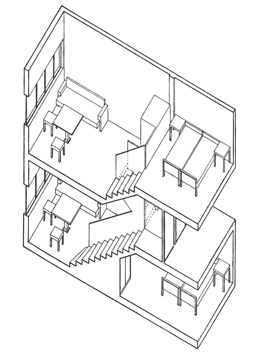 Type ‘F’ living units, in: Sovremennaya Arkhitektura, 1929, No. 1, p. 14
And this is how they imagined that. Every living unit had a window which looked directly onto nature. They would share dining rooms with other people, but in their apartments they would see only trees, and the sky. Very small living units for one person and for a couple, very Spartan, but deliciously empty because in reality every room was full of stuff. Another interesting point for this kind of project was that architecture and industrial production should go hand in hand. Industry and agriculture should be very close to residential areas. It’s what we now call urban architecture or zero kilometre farming. So it’s also an idea that now looks very progressive and very promising, something that today’s architects think about.
But in the meantime architects had to decide what to do in the existing cities. In 1927 there was a competition for the communal house in VKHUTEIN (Higher Artistic Technical Institute), it was the same VKHUTEMAS, the most modern architecture and art school of the time. And the winning project was basically the same that was realized at the NARKOMFIN building. The team was again headed by Moisei Ginzburg, and he was also the main ideologist of constructivist architecture, and the main editor of the magazine Sovremennaya architektura (Contemporary architecture). His idea was to combine small private units with very generous collective facilities.
 Apartment interior in the NARKOMFIN Building, in: Sovremennaya Arkhitektura, 1929, No. 1, p. 17
Private living unit could be very small, but still it shouldn’t feel tiny. And they solved the problem by combining a very high and rather spacious living area with a small sleeping area of half the height. The further economy of space came from the fact that such units were put along the corridor that connected them and each corridor served 3 levels.
Colour played a very important role in the design of these units. Different colours were used to make the space more attractive and make it feel larger than it was. The colour schemes were developed by Bauhaus professor Hinnerk Scheper who came to Moscow specifically for this purpose. There was no proper kitchen (just a kitchenette), no proper bathroom (just a toilet), because these facilities were collective. This project could be realised because the architects found a very good client – Nikolai Miliutin, who later wrote this book about urbanism. At the time he was a commissar of finance. Commissar was the same as minister, the minister of finance. So, he commissioned the famous NARKOMFIN building.
NARKOMFIN Building. Photo: Anna Bronovitskaya, 2012
NARKOMFIN means people’s commissariat of finance. There is another thing that you should have in mind; with all the rhetoric about the Soviet Union being the country of workers, factory workers actually, factory workers weren’t especially privileged. This building was for educated people who had rather high positions. The house had a very good plot of land with very good connections to the centre of Moscow and to the building of the Ministry of Finance. It was set in the garden on the slope of a hill down to the river with pines.
The complex consisted of three blocks. One block was designed for a kindergarten but it was not realised. There was also a residential block and a communal block with the canteen, kindergarten, and a club for the residents. It was built with very progressive poured concrete technology. But still it needed metal parts for the structure and metal was very scarce, so it really was a privileged project. Of course, it was a complete realization of Le Corbusier’s 5 points of modern architecture, but the NARKOMFIN building was erected before Le Corbusier himself could build anything of large scale. He saw this building and he used its ideas for his famous Unite d’Habitation.
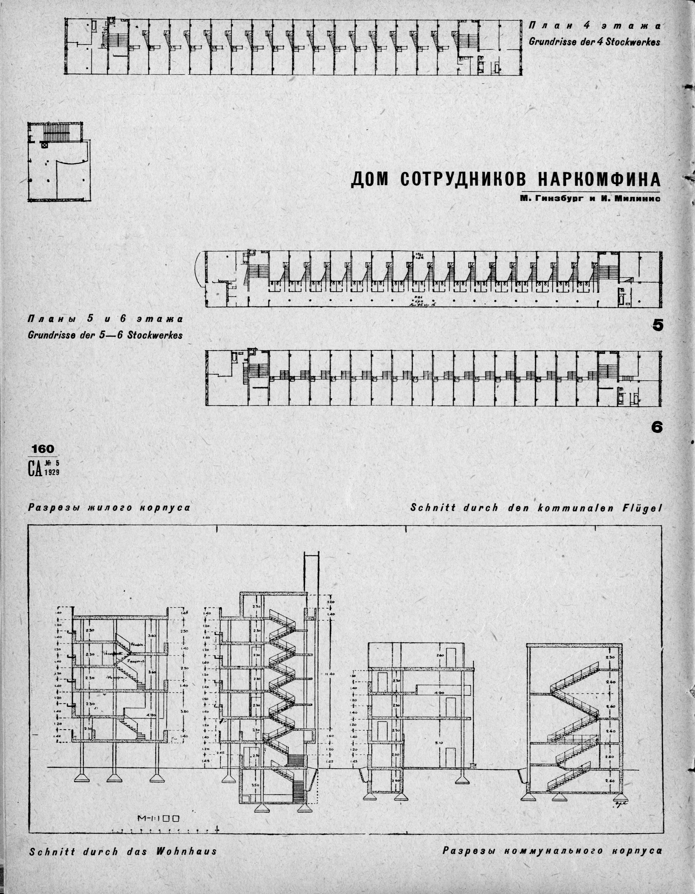
One of the two corridors of the residential block, in: Sovremennaya Arkhitektura, 1929, No. 5, p. 160. Photo : Anna Bronovitskaya, 2012
The communal block had four storeys and one of them was given to children. We don’t have photographs of how the canteen was used but we know that special people were hired to serve the residents, and it was possible to get to the canteen through the elevated walkway, so one didn’t have to go outside. Closer to the ground of the residential block there were larger apartments, normal apartments with three small bedrooms and a small kitchen and private bathroom. But on the upper floor there were small apartments. Of course there was a terrace on the roof which was sometimes used for collective physical exercises. The idea was that people would spend a lot of time there. Nikolai Miliutin decided to build himself an apartment on top of the building. It was the best apartment obviously but it was still very modest, considering that he was a minister. It had three modest bedrooms and an interesting colour scheme.
However, this project didn’t work. People still wanted conventional comfort, and they still didn’t have modern furniture and everyday things so they continued to live a traditional life in a building designed for a completely different style of life. And what is worse, these tiny units that were very good if you lived there alone, or as a young couple, but they weren’t of any help to a family with children and most residents were unhappy.
People who don’t want to restore the house repeat that people are unhappy there, and that nobody would like to live there. But we have a very different example in Moscow in another communal house on Gogolevsky Boulevard of the same time. It was designed by architects who themselves lived there. It was a cooperative house and it still is. It is in better shape as it was repaired regularly and maintained. It has one block with small F type units and a second block with larger flats of more traditional type. There is also a communal block, a sports ground and children’s ground (playground). It’s nothing exceptional from the outside; you wouldn’t turn your head if you passed through. But look what is inside; several years ago a number of apartments were bought by people who have money, some of them have houses in the countryside and they wanted to have small apartment in the centre of Moscow, and some of them are just single people who want to have an interesting place to live. So they hired designers, I am not saying that I really like what they did, but it is trendy. There is obviously market demand for this kind of place. They installed modern showers, they don’t want to cook, they don’t need to cook, and of course nowadays there are so many places to go out, four times a day if you want. A growing number of the urban population, especially in big cities, are now single; it is estimated that 20 percent of adults in big cities around the world live alone. So now architects have to think about how to provide appropriate housing for them, and we already have the solution.
 Textile institute students' communal house, arch. Ivan Nikolayev, design, 1929
The communal house designed by Ivan Nikolayev for students of the Textile Institute was even more radical. It is the most radical residential complex in the world. Even the NARKOMFIN building is a classic machine for living compared to it. The Textile Institute communal house is a machine to produce urban people, because the 1920s was a time of very rapid urbanization. People from the country came to cities and they had to learn how to live there, how to care for themselves. They had to learn how to take a shower, not to clutter the environment, and so on.
This complex consists of a communal block with a big living area, an auditorium, a canteen, a kitchen, and a huge reading room in the upper storey, because this building is for students who have to do homework. Then there was a long dormitory block with a tiny 6 sq. metres sleeping units, like the ones in a railroad carriage. Architect Nikolayev designed one unit for one student, but in reality each was inhabited by two. So there were just two narrow beds, one stool and one shelf for every student in the unit, nothing else. The most interesting block was the connecting sanitary block with toilets and showers. The idea was that you enter and spend your evening in the living room, then you go up to your floor, remove your clothes, go to the showers and toilet, then go to your sleeping cabin and sleep. So the students left their books and other things they needed to study in the living room, they also had lockers for the clothes, and they removed the clothes to send them to the laundry in the evening. On the other side they found their pyjamas, which they put on and went to sleep.
Ivan Nikolayev designed this building when he was 27 years old, two years after he had graduated the VKHUTEMAS. When he was a student he had already married, and he never had a private room with his wife. He always had a corner in someone else’s room, so he could only dream of a tiny but separate place, and he thought it would be wonderful. Maybe it was a little cruel that students had to share their accommodation with one other person, and often dormitories were with twenty people sleeping together, so they didn’t have much space in any case. Of course there were roof terraces and also wide balconies to do physical exercises in the morning, and there was a sports ground.
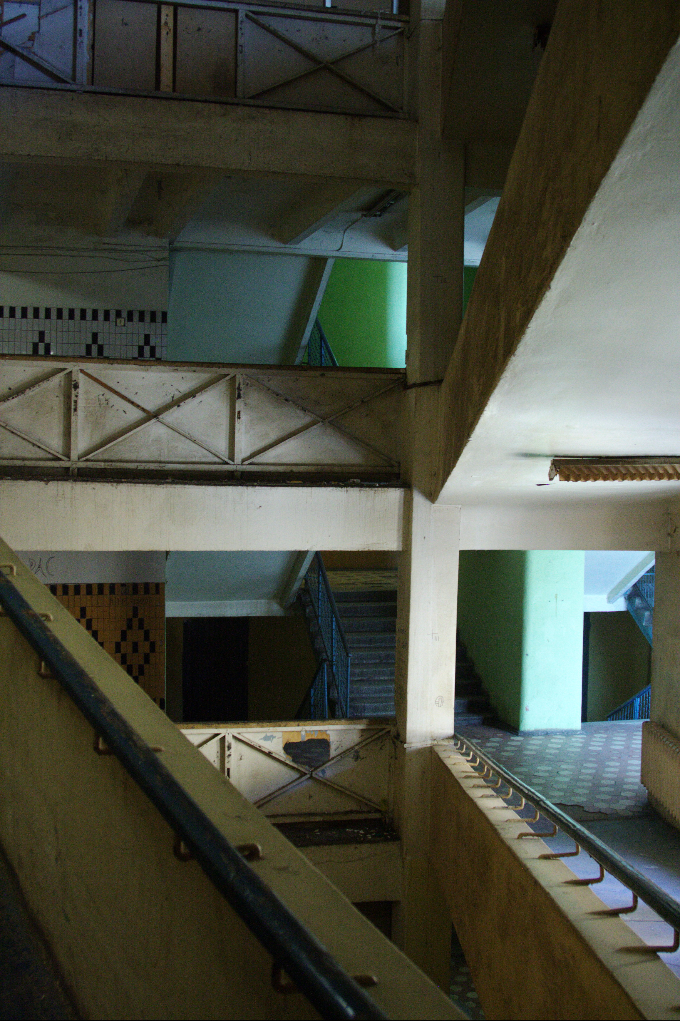

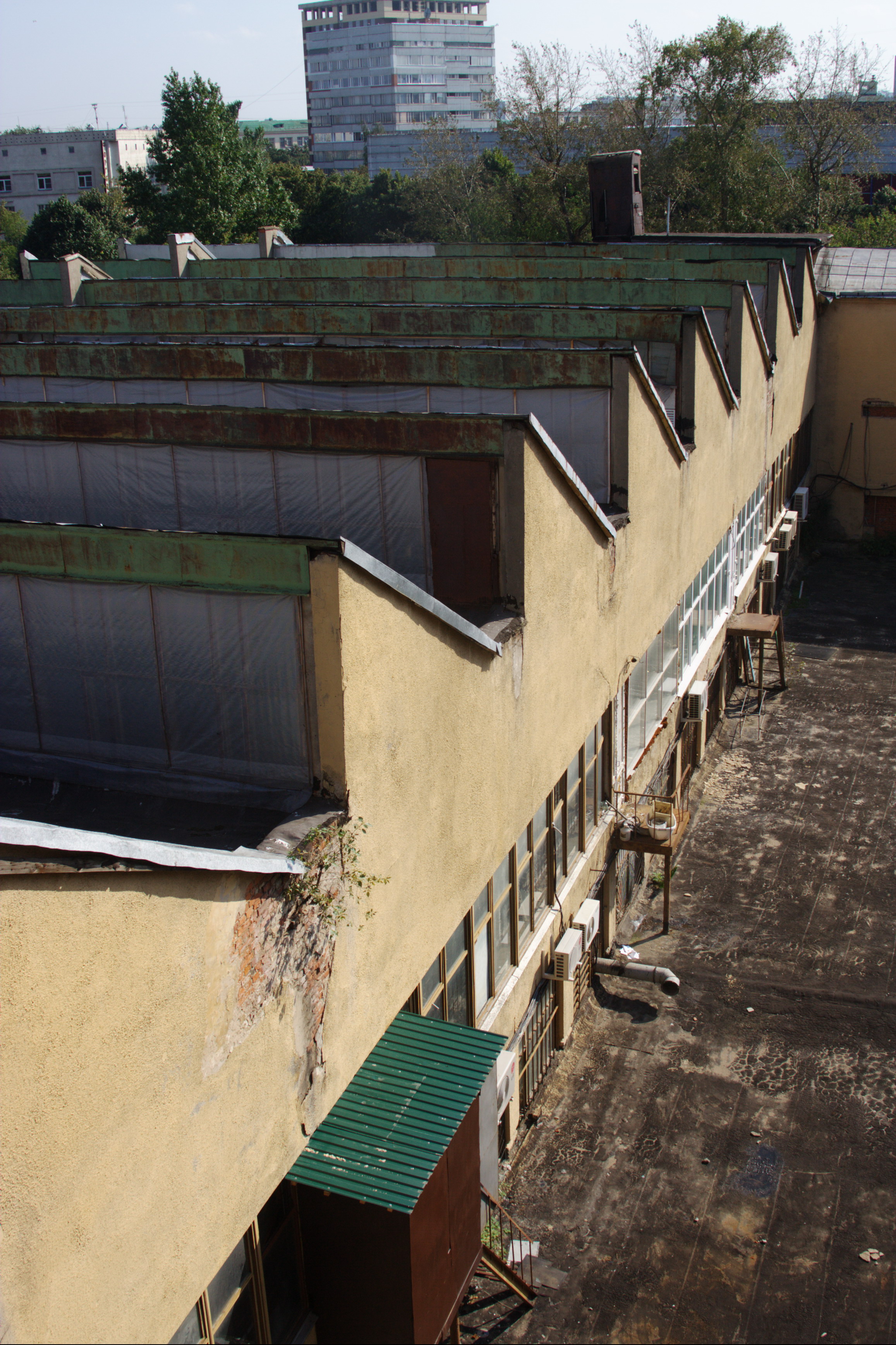 Textile institute students' communal house. Photos: Anna Bronovitskaya, 2012
The building was very impressive artistically. The roof of the reading room had skylights, and the very wide space had natural light. So we are thinking about the sustainability here. On the side there were very small cabins for individual study, when you had to prepare your paper and really concentrate. And for the vertical connection there was a ramp (it is the best surviving part). Ramps are always very impressive, but the architects of the 1920s preferred ramps to stairs not because they looked good, but also there was an idea that when you go up or down the ramp, you are not thinking about what your feet are doing, so you can concentrate on your ideas or even read as you walk, and nowadays we do a lot of reading and texting when we walk.
Two years ago the dormitory block was put under restoration and they destroyed everything just preserving some parts of the metal structure, and they built inside a completely new concrete structure and walls. And they also replanned; it will still be a students’ dormitory, so they are making bigger rooms, and putting shower and toilet between every two rooms, it is an improvement, but if we take into account that now we don’t need so much space, we use ipods or other reading devices instead of books so we don’t need space for storing them. We don’t need so much space for keeping our clothes, because it is very easy to replace them, so we don’t need to keep things we have finished with. Actually I think that many people, especially young people now, you may think otherwise, but I know some people who really only need a bed in their room, to do everything.
So, these were the most radical schemes. What was more normal? It is interesting that radical designs were commissioned by the state, by federal authorities, and municipal authorities were more practical. They had to think about what to do now. Luckily they couldn’t afford to destroy all the old city fabric. So the idea was – let’s use the buildings but not repair them, so when they dilapidate, we will replace them with something new. But it didn’t happen. The first thing that happened to the existing city was the completely new way of using the public space. All open city space became public space and it was used for all sorts of events, and some of them were propaganda and others were just life. Because another thing that not many people think about is that the time of Russian avant-garde was also a time of New Economic Policy (NEP). It was introduced in 1923 by Lenin who felt that it was necessary to allow some degree of private business into the economy for it to work. So there were a lot of private businesses – cafes, small theatres and cinemas, etc. The new residential districts were the most that happened in terms of new construction.
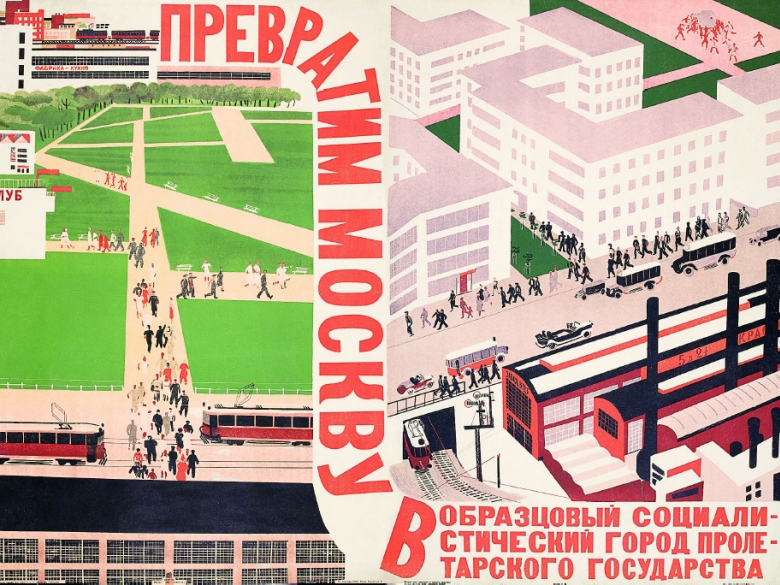
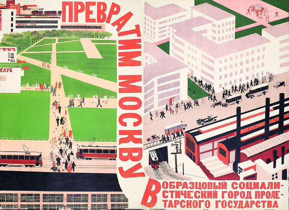 The poster by Alexander Deineka, 1930
The contemporary poster announced: “Let’s transform Moscow into an exemplary socialist city of the proletarian state”. What does this mean? It once again means that houses were next to the work place, so people didn’t lose time while travelling, so houses existed within the network of social infrastructure. All sorts of infrastructure, always sports grounds and small stadiums, always clubs, and schools. And there is something that was called a factory kitchen. It was a canteen of industrial scale. Of course, transportation links were necessary as well, and some degree of greenery and closeness to nature whenever possible. And what this poster does not show and the thing that was also very desirable for this kind of developments was to be close to some old architecture – a monastery or a church or some old palace or something like that. So architects oriented developments to have good viewing points to old architecture.
There were a lot of different versions of planning, but what is interesting is that all these houses shared the standard plans of an apartment, they were approved by the Moscow council, but the houses looked very different. Now once again they are under threat of being demolished and replaced by something more profitable when they could have been a very good living environment if they had been properly repaired. They are of human scale and every apartment always has windows on two sides to allow good air circulation.
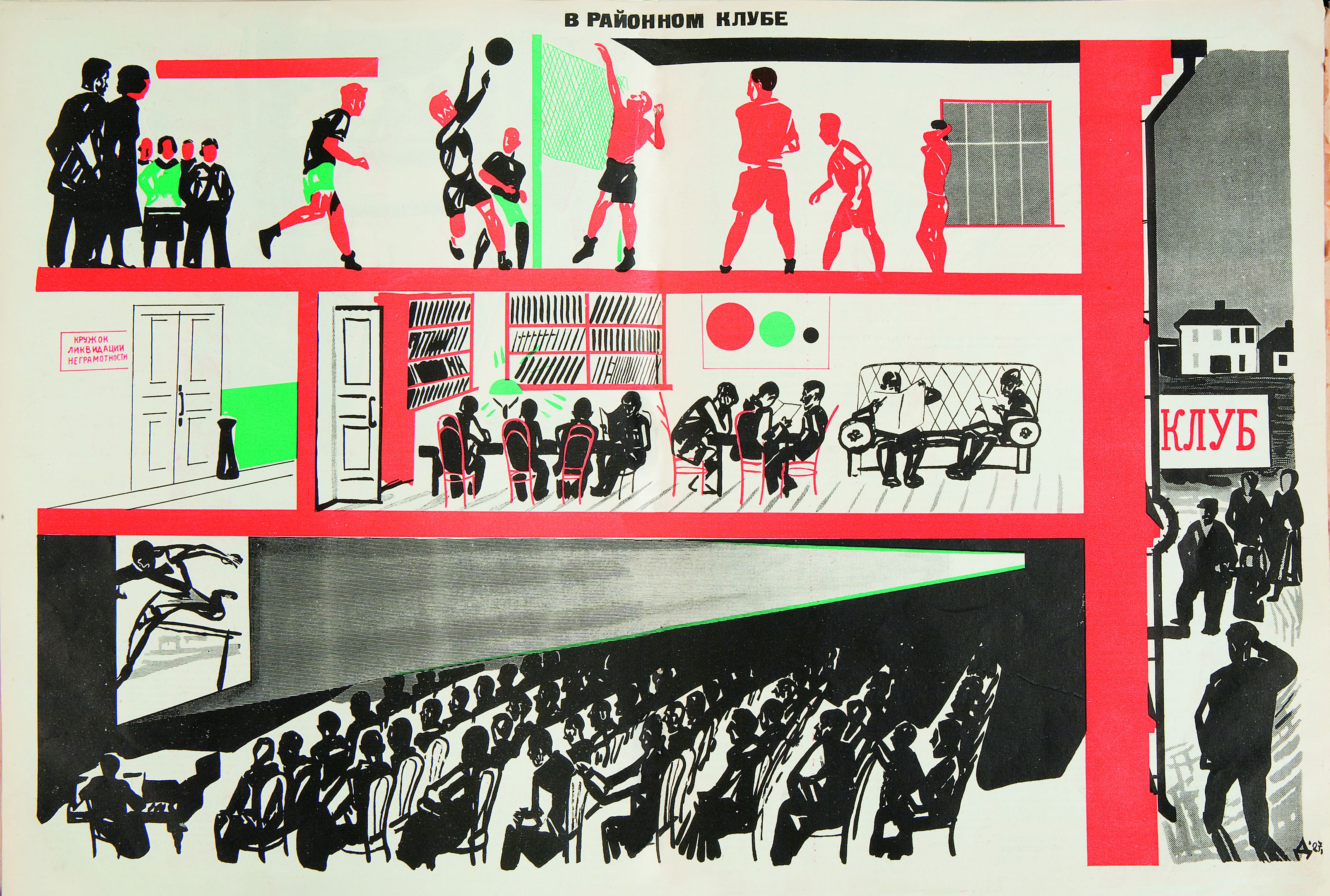 Workers’ club, drawing by Alexander Deineka, in: Bezbozhnik u Stanka, 1927, No. 3, pp. 12-13
The next type is the workers’ club. Now people don’t always understand what this club is. For us now it is the place where we can go to drink and dance, or listen to music, but a workers’ club was a place for adult education, and also for entertainment, along with propaganda, and sports. It was a place where people went to see a movie or attend a public lecture; there were reading rooms with the new literature and newspapers; there were classrooms were people learned to read or do something more complicated. And of course there were sports and musical societies and so on. In the beginning the clubs were in old buildings.
Before the revolution, the normal workday in the factory was ten to twelve hours, or even 14 hours a day. After the revolution, an 8 hours workday was brought in, so the idea was that people would spend their free time to work on themselves, to evolve into modern people, into the builders of communism, as it was called, but first of all, into truly modern people, to get more education and develop culturally. However, people stubbornly preferred to go home to their families or to go to a bar to drink beer after work. So, in 1927 there was a decision in the trade unions to spend 10 percent of their budgets to build new clubs of interesting architecture. And this is the reason that in 2 years we got a number of truly exceptional architectural masterpieces in forms of these clubs.
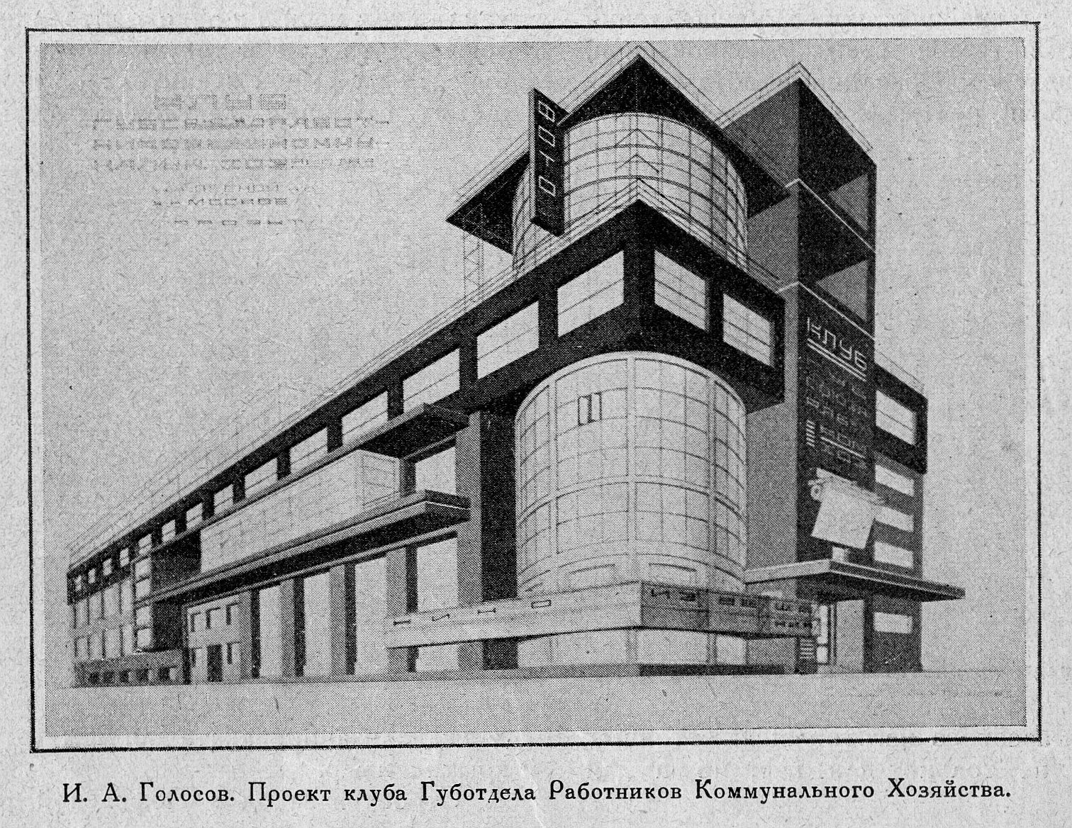 Zuyev klub by Ilya Golosov, in: Stroitel'stvo Moskvy, 1927, No. 7, p. 11
The “Zuyev klub” in Moscow still works as a house of culture. And it looks almost as it did before – it is really beautiful. Other clubs were not so lucky. At some point there was a general feeling that clubs and houses of culture were no longer necessary, and they were rented by various small businesses. For example, the small Rusakov club by Viktor Melnikov, the most famous avant-garde architect, was given to the city but it was never used and it is not possible to get inside. Now in Moscow there are hundreds of different schools of foreign languages and yoga classes, and public lectures, and lots of activities that should happen inside the clubs, but still they happen mostly in basements or some ad hoc adjusted spaces. And we feel that the Moscow government has to implement a programme to find proper use to workers’ club buildings.
Factory kitchens, as did many buildings of that time, had interesting plans – they couldn’t be seen from the pedestrian’s point of view. They counted on airships, but now we can look at them with the help of "Google Earth". And again now we have very a popular café that is called Vokzal (Railway Station), and it is in the railway station, it’s a huge space with a lot of tables and self service. It’s noisy but it’s still very popular. Again I think that this formula, when you have limited choice of meals, but cheap and wholesome and you can get it quick in the formula of a business lunch that these buildings could be somehow in use.
In Samara, for example, there was a design for some commercial development that was planned on the site of a factory kitchen. They had a very strong campaign and preservation movement, who ran a cycling tour to bring attention to the problem. We heard that now there is a kind of agreement that city authorities will give the developer permission to build something huge in the city centre if they restore the monument.

Public bath, in: Stroitel'stvo Moskvy, 1930, No. 6, p. 9. Photo: Anna Bronovitskaya, 2012
You know that many new apartments didn’t have bathrooms or even showers, but everywhere nearby public baths were established, sometimes with swimming pools. The idea was quite nice and in 1928 alone for example, thirty thousand showers were installed in workplaces. The idea was that people should shower at work rather than have a shower in their apartment as it’s more economical. Now of course we cannot abandon our bathrooms at home, but a growing number of workplaces have installed showers to promote cycling. People could cycle to work and create less traffic and also to be more ecological. To be able to do this, they have to be able to take a shower and change before starting work. It could be nice to have such kind of small swimming pools and bathing terraces on the top of our buildings again. And of course, a very large part of city space was given to sports everywhere and once again it’s become a trend.

 'Greater Moscow' (1926) plan by the engineer Sergei Shestakov, in: Stroitel'stvo Moskvy, 1929, No. 2, pp. 8-9
Another plan that was developed in 1926 by the engineer Sergei Shestakov was a Greater Moscow plan. The idea was how to connect the city and its surroundings with smaller towns so they could share their production and functions, and still be connected in culture and education and things like that. And now we are back to this idea; the Moscow government has announced an international competition on the concept of the development of a greater Moscow agglomeration, so very much of the 20s avant-garde ideas are relevant to our today.
Straipsnis PDF formatu:
http://leidiniu.archfondas.lt/sites/default/files/71-82_lecture_anna%20bronovickaja.pdf
